
Ecommerce - PDP Redesign
Designed using the Honeycomb UI System
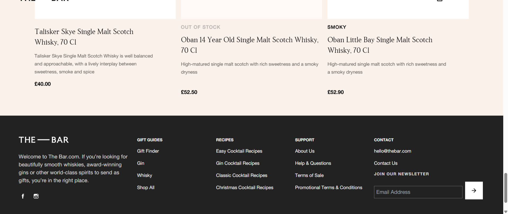
Diageo’s global portfolio spans 200+ premium spirits brands — yet their product detail pages (PDPs) were fragmented, inconsistent, and difficult to scale.
As the UX designer for this initiative, I led the redesign of a unified PDP framework built on the Honeycomb design system, ensuring consistency, accessibility, and a premium brand experience across markets.
This project transformed a scattered ecosystem into a cohesive, system‑driven product experience that supports both user needs and business goals.
Role
Lead UX Designer
Timeline
6 weeks
Impact
50% Reduction in Custom UI Development
Team
BA, Engineering, QA
Timeline
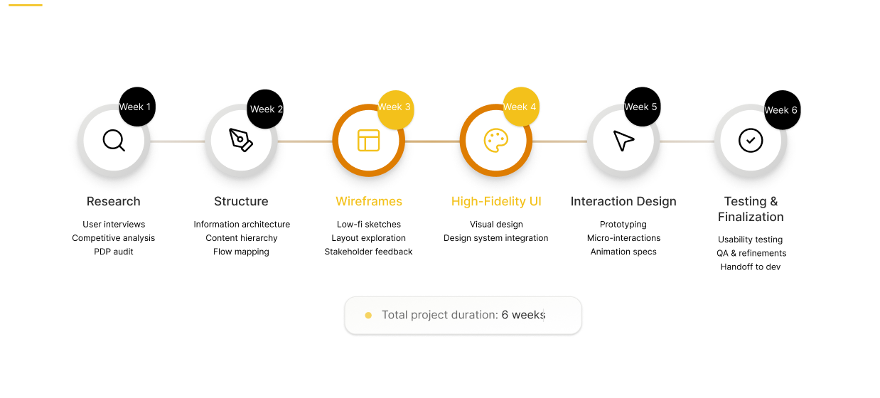
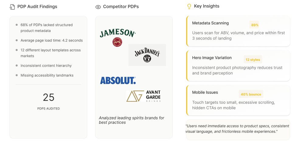
The Challenge
Inconsistent layouts that diluted brand value
7+ CTA styles, creating a broken interaction model
Accessibility failures below WCAG 2.1 AA
Mobile responsiveness issues, contributing to a 40% bounce rate
12 different PDP templates, making scaling nearly impossible
UX Goals
Build a unified, scalable PDP framework aligned with Honeycomb
Establish a clear visual hierarchy prioritizing product metadata and CTAs
Ensure seamless cross‑platform experiences
Reduce design-to-development time through reusable components
Maintain brand equity across Diageo’s diverse portfolio
Research Insights
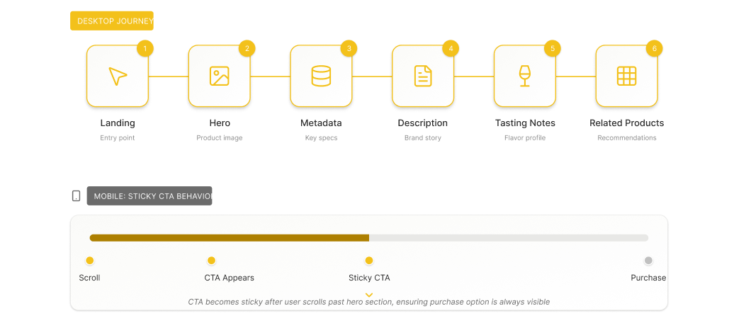
User Flows
These principles helped align the cross‑functional team and prevented scope creep.
Concept Exploration
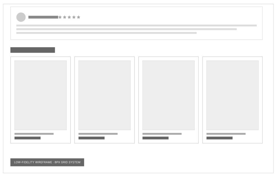
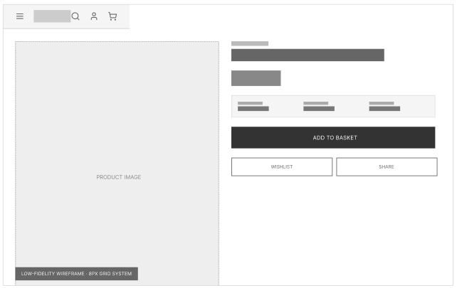
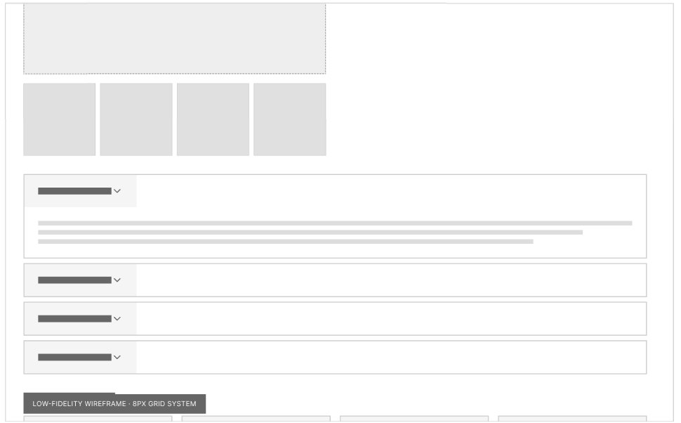
Low‑fidelity wireframes helped validate:
Priority of information
Readability of long-form content
Balance between imagery and text
CTA placement for conversion
Modular sections for scalability
Design System Integration
Each component follows Honeycomb’s tokens for spacing, radius, color, and interaction states.
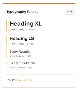
Typography
Confident H1 for product titles
Clear section headers
High‑contrast body text
Structured metadata styles
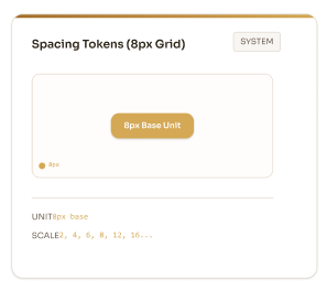
Grid & Layout
I established a 12‑column grid with generous margins and an 8px spacing system. This created:
A strong left‑aligned content spine
Clean separation between metadata, features, and reviews
A premium, airy feel that supports the brand
The grid ensures the layout feels intentional and balanced across desktop and mobile.
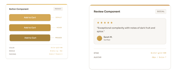
Reusable Components
Primary CTA
Quantity selector
Rating block
Feature cards
Flavour profile list
Awards badges
Review cards
Related product cardses
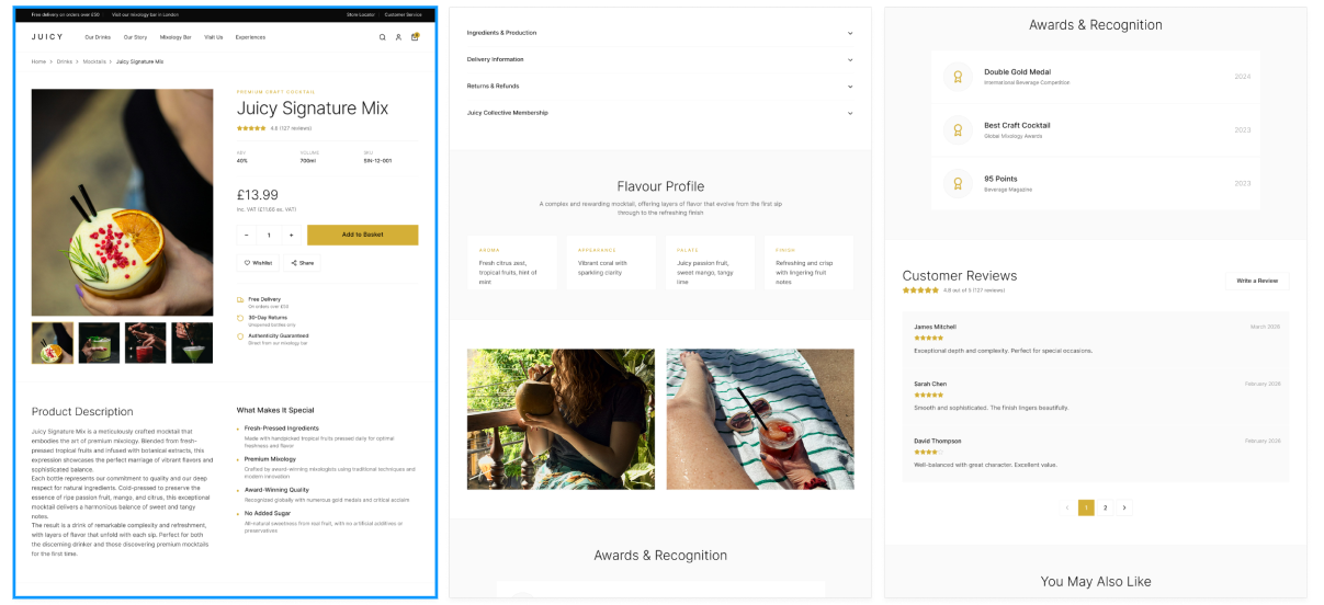
Final Design
The final PDP delivers:
A premium, structured layout
Immediate access to key metadata
Rich storytelling through tasting notes, history, and awards
A frictionless mobile experience
A scalable system for 200+ brands
85% Cross‑Brand Consistency Score
Unified experience across global markets.50% Reduction in Custom UI Development
Design-to-dev cycle time cut in half
Impact
Reflection
This project demonstrates the power of UX systems thinking — creating a scalable, cohesive PDP framework that balances user needs, brand storytelling, and development efficiency. By aligning with the Honeycomb design system, the solution delivers consistency, accessibility, and a premium experience across Diageo’s global portfolio.